Review & Design
The command center for your document's final look
The Review page is where everything comes together. Preview every page of your document at full fidelity, fine-tune colors and typography, reorder slides, edit images in-place, control map views, and add custom pages -- all without leaving a single screen.
1. Review Page Overview
The central hub where everything comes together
When you navigate to the Review step, you see three main areas working together:
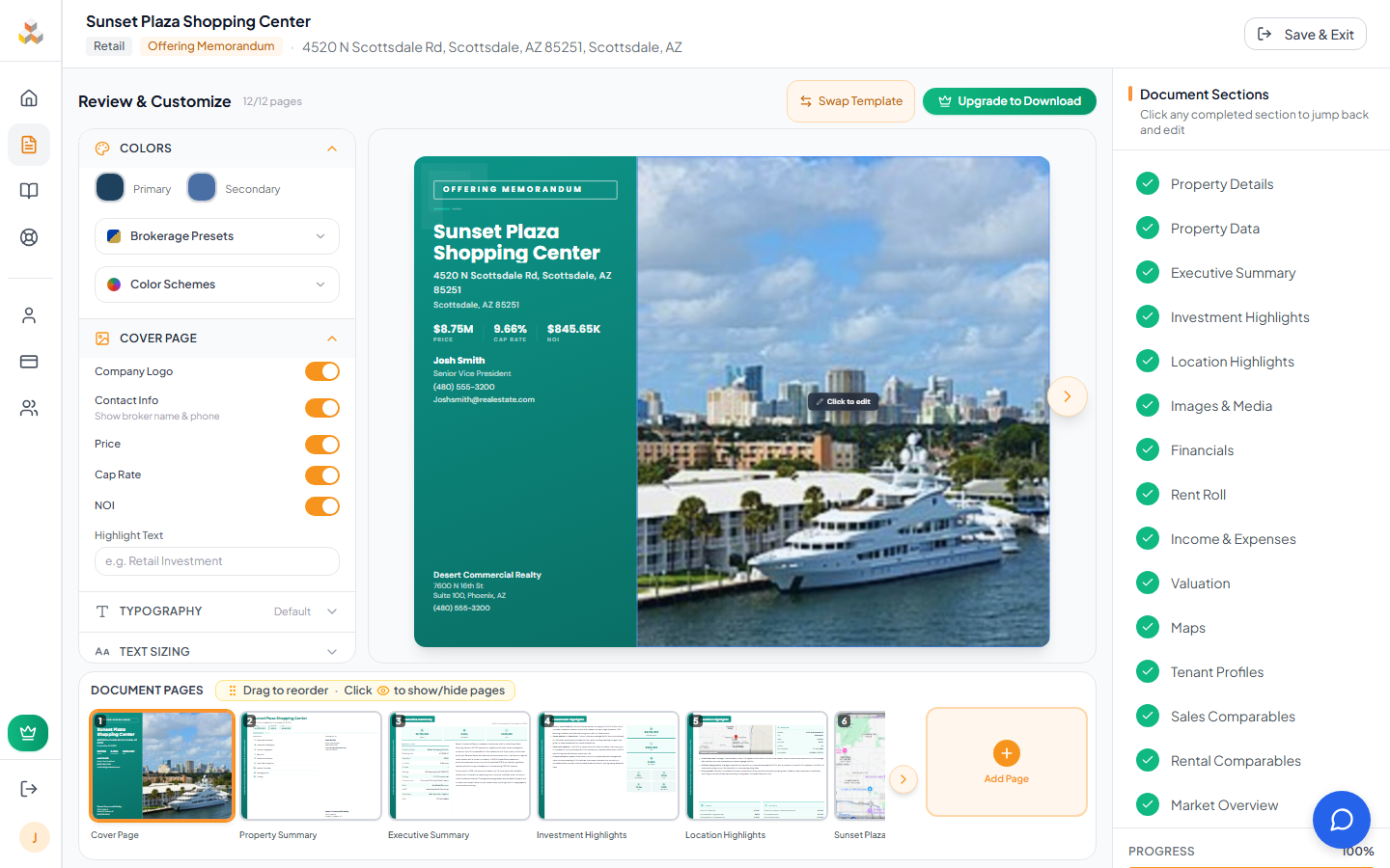
Design Panel
Colors, fonts, cover options, and text sizing controls on the left sidebar.
Document Preview
Full-fidelity page preview in the center. Navigate with arrows or keyboard.
Thumbnail Strip
Draggable page thumbnails at the bottom. Reorder, show/hide, and add custom pages.
Navigation: Use the ← → arrow keys or click the chevron buttons to move between pages. The page counter at the bottom shows your position (e.g., "Page 3 of 42").
Page counter: Displays the count of visible pages out of total pages. Hidden pages are excluded from the visible count but remain in the strip for toggling back on.
Header actions: The top bar shows "Swap Template" and "Download PDF" buttons. Free users see an "Upgrade to Download" prompt instead of the PDF button.
2. Text Styling
Fine-tune font size and line height per section
Hover over any text content area in the document preview and a blue highlight appears with a "Text Size" button. Click it to open a compact popover with two controls:

Font Size
11 presets available: 10, 11, 12, 13, 13.5, 14, 15, 16, 18, 20, 22 pt. Default is 13.5pt.
Line Height
10 presets: 1.2, 1.4, 1.5, 1.6, 1.7, 1.8, 1.9, 2.0, 2.2, 2.5. Default is 1.85.
Supported Sections
You can also adjust text sizing from the Design Panel on the left -- the "Text Sizing" accordion section lets you pick any section from a dropdown and set its font size and line height without having to navigate to that specific page first.
3. Image Editing
Zoom, pan, rotate, and reframe every photo in place
Hover over any image in the document preview to reveal the floating edit toolbar. It appears at the bottom of the image as a dark, frosted-glass bar with grouped controls.
Zoom
10% to 300% via slider or +/- buttons. The 10% floor lets you zoom way out for wide crops; drag to pan when zoomed in beyond the frame.
Size Mode
Fit (contain) shows the full image with letterboxing. Fill (cover) fills the area, may crop edges.
Rotation
Cycle through 0, 90, 180, and 270 degrees. Clockwise and counter-clockwise buttons. Current angle shown as a badge.
Center / Reset / Replace
Auto-center the image, clear all transforms back to default, or swap the image file entirely.
4. Design Panel
Colors, typography, cover options, and text sizing in one sidebar
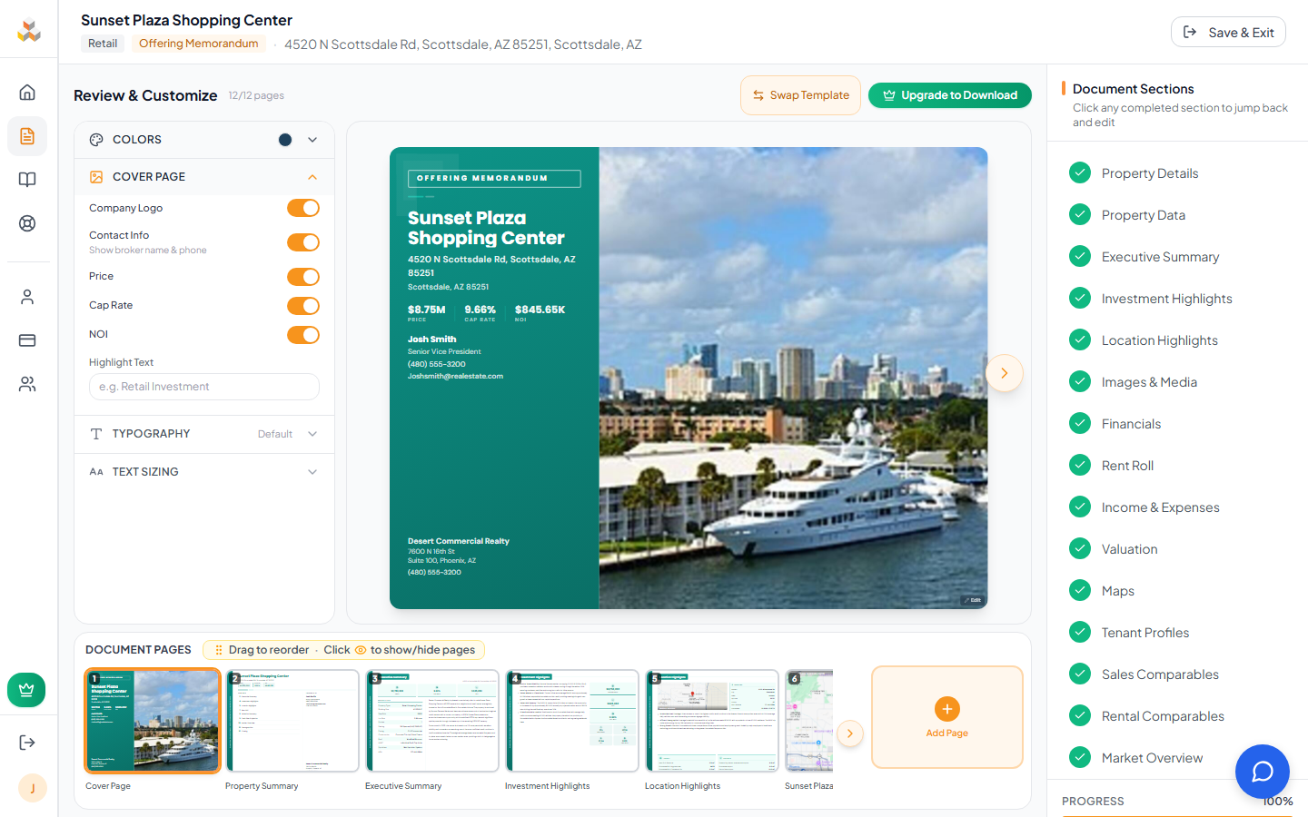
The Design Panel sits on the left side of the Review page as a 288px-wide accordion sidebar. Each section expands independently, with the Colors section open by default.

Colors
Primary & Secondary: Click the color dots to open a full color picker. Changing the primary color auto-derives a complementary secondary color.
Brokerage Presets: 16 CRE-inspired presets modeled after major brokerages. Each sets primary, secondary, and optionally text color in one click. Includes presets inspired by RE/MAX, Keller Williams, Coldwell Banker, CBRE, JLL, Cushman, and more.
Color Schemes: Additional palette options beyond brokerage brands, organized in a collapsible 4-column grid with diagonal gradient previews.
Typography
Font Packages: 9 curated title + body font pairings rendered with live Google Font previews:
Classic
Montserrat + Raleway
Modern
Poppins + DM Sans
Editorial
Playfair + Source Sans
Luxury
Cormorant + Lato
Heritage
Libre Baskerville + Open Sans
Bold Impact
Oswald + Roboto
Elegant
EB Garamond + Nunito Sans
Tech Forward
Space Grotesk + Inter
Timeless
Merriweather + Source Sans Pro
Customize Fonts: Expand the "Customize Fonts" toggle below the packages to pick any title and body font independently from the full list.
Cover Page Options
Toggle switches control what appears on the cover page:
- Company Logo: Show or hide your brokerage logo
- Contact Info: Broker name and phone number
- Price / Cap Rate / NOI: Financial metrics on the cover (sale documents)
- Available Space / $/SF: Shown for leasing documents instead of sale metrics
- Highlight Text: Free-form text field, e.g. "Retail Investment" or "NNN Opportunity"
Text Sizing (Panel)
The fourth accordion section in the Design Panel provides text sizing without needing to hover. Select any content section from the dropdown, then adjust font size and line height. This is the same data as the hover overlay -- changes here update the overlay and vice versa.
5. Slide Reordering
Drag-and-drop page thumbnails to rearrange your document

The bottom strip displays every page in your document as a miniature thumbnail rendered at 14% scale. Each thumbnail shows the real page content, a page number badge in the top-left corner, and a label below.
How to reorder: Click and hold any thumbnail, then drag it left or right to a new position. A translucent overlay follows your cursor during the drag. Release to drop. The new order saves immediately.
Visual feedback: The dragged thumbnail becomes semi-transparent at its original position, while a bordered ghost follows your cursor showing exactly where it will land. Other thumbnails shift smoothly to make room.
Scroll behavior: When you have many pages, chevron buttons appear at the left and right edges of the strip. Click to scroll 400px in that direction. The strip also auto-scrolls to keep the selected thumbnail visible.
6. Page Visibility
Show or hide individual pages from your document
Every thumbnail has an eye icon in the top-right corner. Click it to toggle a page's visibility. Hidden pages are visually muted in the strip and excluded from PDF export.
Visible page: Normal thumbnail with a shadow. The eye icon appears on hover. The header counter reads, e.g., "18/22 pages" to show visible vs total.
Hidden page: The thumbnail becomes desaturated and half-transparent with a dashed border. A centered eye-off icon appears over the preview. The visibility toggle icon stays permanently visible so you can re-enable the page.
7. Custom Pages
Add your own pages with images, PDFs, or rich text content
Click the "Add Page" button at the end of the thumbnail strip to open the custom page creator. Four layout templates are available:

Full Page Media
Edge-to-edge photo, floorplan, or PDF page. No title bar, pure visual impact.
Title + Media
Branded header with your document's colors, plus an image, PDF, or site plan below.
Title + Text
Branded header with a rich text editor below. Add formatted paragraphs, bullet lists, and more.
Media & Text
Side-by-side layout: a photo or PDF on one side, rich text content on the other.
Editing: Custom pages show a pencil icon on their thumbnail on hover. Click it to reopen the editor modal with the page's existing content pre-filled.
Deleting: In edit mode, a trash icon appears in the modal header. Click it for a confirmation prompt, then confirm to remove the page.
Reordering: Custom pages are draggable just like any other page. Place them anywhere in your document sequence.
8. Template Swap
Change your document's design without losing any content
Click "Swap Template" in the Review page header to open a modal displaying all available templates for your document type. Each template is shown as a live cover preview rendered with your actual document data and current accent color.

Live previews: Each template card renders your real cover page data (property name, photo, address) with the template's layout, so you can see exactly how your document will look.
Current template: A "Current" badge appears on the template you're using now. The selected template gets a blue ring highlight.
Non-destructive: Swapping templates transfers all your content instantly. No data is lost. Your photos, text, financials, and custom pages all carry over. Try different looks freely -- you can always swap back.
6 templates available: Classic, Modern, Professional, Executive, Premium, and Heritage. Each has distinct layouts, typography, and visual character.
9. Fullscreen Preview
Expand your document to fill the entire screen
The fullscreen preview overlays a dark backdrop and displays the current page scaled to fill 90% of the viewport (capped at native 1:1 resolution). It provides a distraction-free view of each page.
Navigation: Large left/right arrow buttons sit at the viewport edges. You can also use keyboard arrows: ← previous, → next, Esc close.
Page indicator: Below the page preview, a label shows the page name and position, e.g., "Executive Summary -- Page 3 of 42".
Dynamic scaling: The preview computes the optimal scale based on your viewport dimensions so the page fills available space without overflowing. Resize the browser and it recalculates instantly.
10. Map Controls
Fine-tune zoom level, map type, and label visibility on map pages
When you navigate to a Location Highlights or Demographics page, an "Edit Map" button appears floating over the map image. Click it to open an inline control popover.

Zoom Level
Range 8 to 17 with descriptive labels for each level:
Map Type
Three options: Road (street map), Satellite (aerial imagery), and Terrain (topographic). The active type is highlighted in the button group.
Show Labels
Toggle to hide points of interest and transit labels while keeping road and city names visible. Available on both Location Highlights and Demographics pages. Useful for decluttering the map when surrounding businesses and transit stops are distracting.